
Sprint 5 - PermaCheck
Art and sound effects
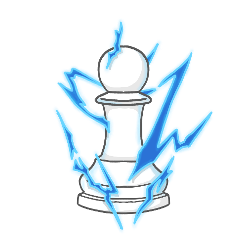
This sprint was pretty straightforward for me and within my comfort zone. I mostly worked on art and sound effects throughout the sprint, which are two of my favorite areas. I started by beginning on some of the icons for the various modifiers implemented by our designer. Thankfully, I was given descriptions of how each should be presented in the game design document, so I didn't have to ask many questions, and the process went very smoothly. The first one I completed was the Rapid Deployment icon. The type of lightning I pictured was akin to shows like Dragon Ball, where a character can generate energy in the form of lightning formations around them, so I made this icon visually similar to that.
Next, I worked on the icon for the Efficient Construction modifier. This one was very simple: just one piece hitting another with a hammer.

After that, I made the icon for Momentum Boost, which was supposed to be a broken piece with coins exploding out of it. This one was simple and fun to make, as I just needed to select one half of the piece after drawing a thicker line where I wanted it to break, and move it into position. I also added glowing effects to emphasize the breakpoint and the explosion of coins.

Finally, I made the icon for the Revive modifier. This one was slightly tricky, as I wanted to convey a sort of "rising from the dead" idea for the icon, and I wasn't sure that I liked the energy going off the bottom of the image. I ended up sticking with it and added glowing reflections to give the icon some simple visual interest.

I tried to make all of the icons interesting while maintaining their simplicity and visual readability. Since the screens of most devices running this game are quite small, I wanted to make sure each one is easily readable at a small scale.
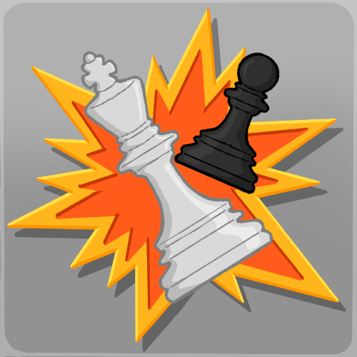
After making these icons, I went on to create a revamped icon for the app that will eventually be uploaded to the Google Play Store. I recreated the placeholder logo our producer made early in development, just adding a little more contrast and shadow and cleaning up some of the linework. The designer and I went through a few background colors before he ultimately chose light grey, which I think is a good choice and makes the explosion pop.
Besides making icons for the game, I also created another simple particle effect. This effect will show players which squares they can place towers on by lighting a green border around the available areas. I tried to figure out how to use a base shape similarly to how I used that setting in the spawn effect, but I couldn't figure out how to create a square border with no particles in the center. I ended up creating duplicate emitters within the same particle system that projected lines at equal distances to create the illusion of a solid outline, and I think it turned out very well.

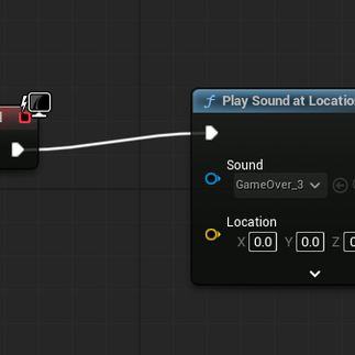
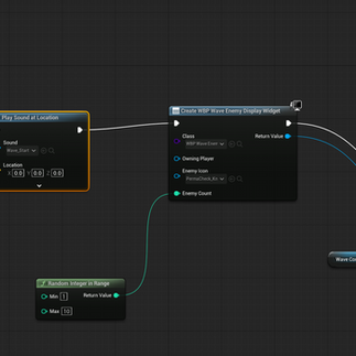
I also sourced some sound effects for the game. I sourced the sounds for UI button presses, the inability to press a UI button, the game-over screen sound, and the sounds that play at the start and end of a round. I was able to use the Play Sound nodes to implement the UI sounds on my own, though I needed some help making the others work correctly.


Overall, I was very content with this sprint and had fun making the icons and finding interesting sounds for the game. My team praised my artwork as well, which made me very proud, and I will continue to bring my best to the game.